Components
Calendar(iOS)
A visual calendar display for displaying availability and/or selecting dates.
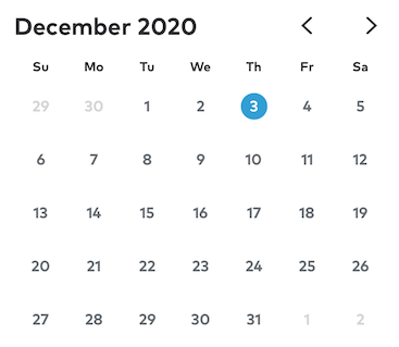
The CalendarPicker can be used to both display availability information (by marking dates with a dot or a slash mark), and solicit date selection(s) from the user. It can be configured to display any possible date range, and can be made interactive by registering for its delegate callback methods.
Scrollable Range
By default, the CalendarPicker component can scroll infinitely far into the past and future. In situations where such a wide range does not make sense (e.g., selecting birthdays or scheduling future appointments), the range can be limited by specifying the number of future/past months that the user should be allowed to scroll to. Furthermore, the calendar can be preconfigured to display a particular month/year.
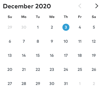
calendarPicker.goToDate(date: december2020, animated: false)calendarPicker.previousMonthCount = 0
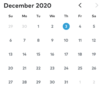
calendarPicker.goToDate(date: december2020, animated: false)calendarPicker.additionalMonthCount = 0
Enabling/Disabling Selection
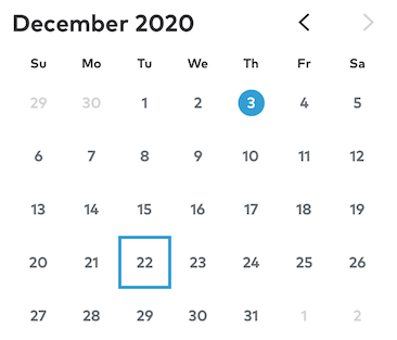
CalendarPicker supports both singular and multiple selection of calendar dates. Selected dates are stored internally, and persisted when the user scrolls between months. Date interaction notifications are sent to the CalendarPicker’s delegate.
calendarPicker.allowsSelection = true // Default is truecalendarPicker.allowsMultipleSelection = false // Default is false
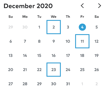
In addition to being notified when the user interacts with the calendar’s selected dates, the developer may query or set the calendar’s selected dates directly.
calendarPicker.selectedDates = [dec2, dec11, dec23]print(calendarPicker.selectedDates.map({ dateFormatter.string(from: $0) }))
Date Marks
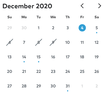
Date cells can be assigned slash or dot marks by implementing the delegate callback methods:
CalendarPicker(_ CalendarPicker: CalendarPicker, cellHasDotForDate date: Date) -> BoolCalendarPicker(_ CalendarPicker: CalendarPicker, cellHasSlashForDate date: Date) -> Bool
Configuring the Calendar Height Modes
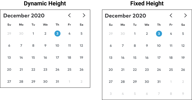
CalendarPickers internally manage their own height – they should never have a height constraint imposed upon them.
The CalendarPicker supports two height modes: Fixed and Dynamic. A fixed height CalendarPicker will always show the maximum number of rows that can displayed for a given calendar, even if the current month requires fewer rows. For a Gregorian calendar, the maximum number of rows a month can need is six.
If the calendarHeightMode is set to dynamic, then the calendar will expand and collapse as as necessary to display the minimum number of rows possible for each month. After transitioning to a new month, a dynamic height CalendarPicker will update its own internal height constraint and notify its delegates of the update.
calendarPicker.calendarHeightMode = .fixedcalendarPicker.calendarHeightMode = .dynamic // Default
Configuring the Cell Height Modes
CalendarPicker cells also have configurable heights, either fixed or aspectRatio. Fixed height cells are configured with a set constant height that they will conform to regardless CalendarPicker’s width. In contrast, a cell with an aspectRatio height is configured with a fixed aspect ratio, which the CalendarPicker uses (along with its own width) to compute each cell’s height.
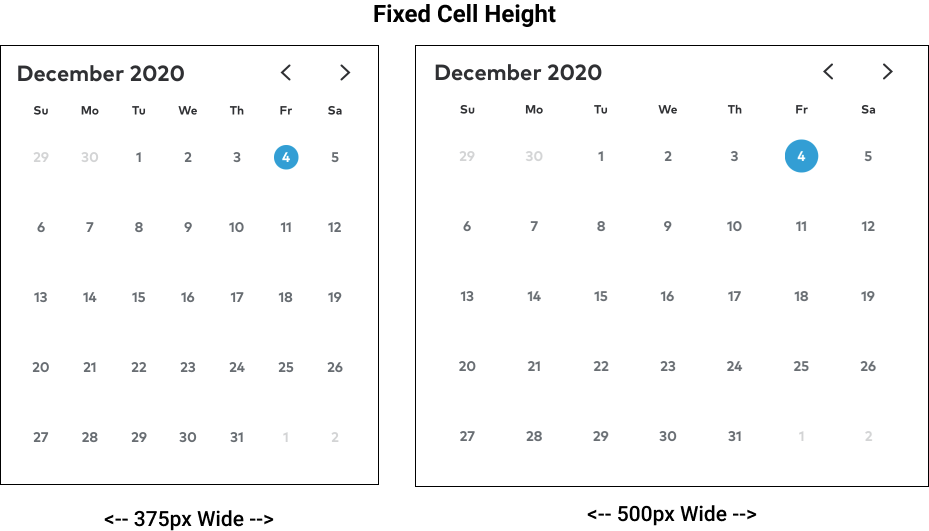
calendarPicker.cellHeightMode = .fixed(70)
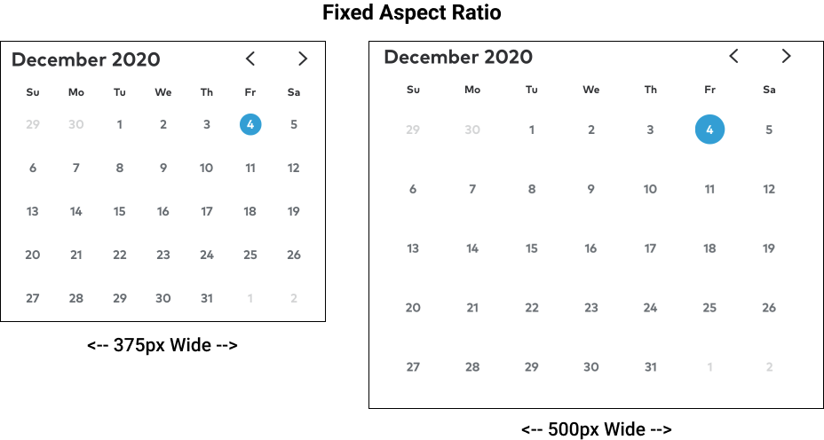
calendarPicker.cellHeightMode = .aspectRatio(1) // Default
Calendar Content Insets
When a user swipes between the months of a CalendarPicker, the cells can only remain visible while they are inside of the CalendarPicker’s frame (at which point they will clip). To make the cells visibly scroll all the way to the edge of the parent view, you can use the CalendarPicker’s contentInset instead. Adjusting the contentInset will push the visible grid inward from the frame’s edges in the same way that insetting the frame would.
The following image shows two otherwise visually identical calendars in the middle of a scroll between months. Here, the calendar on the left has a full width frame but it’s left and right contentInset is set to 16px. The calendar on the right has a frame that has been inset 16px from its parent. Notice that, in the image on the right, the date cells clip out of frame before they reach the edge of the screen.
Note: Top and bottom frame insets are unaffected by month to month scrolling.
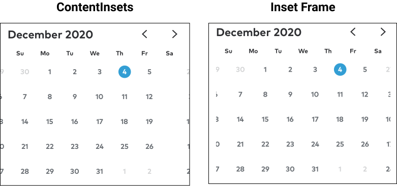
// LEFT (Default)calendarPicker.contentInsets = UIEdgeInsets(top: 12, left: 16, bottom: 12, right: 16)calendarPicker.snp.makeConstraints { make inmake.width.equalToSuperview()}
// RIGHTcalendarPicker.contentInsets = .zerocalendarPicker.snp.makeConstraints { make inmake.leading.trailing.equalToSuperview().inset(16)make.top.bottom.equalToSuperview.inset(12)}
CalendarPicker Header
The CalendarPicker’s header (month, year, and month arrows) can be hidden to just display the grid of dates.
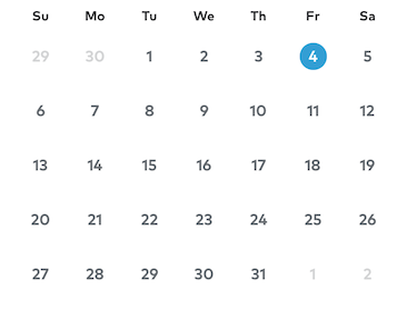
// RIGHTcalendarPicker.hideHeader = true
Delegate Callbacks
CalendarPicker supports the following delegate callback methods
@objc optional func CalendarPickerHeightDidChange(_ CalendarPicker: CalendarPicker)
Called when a dynamic height calendar scrolls to a month with a different number of weeks@objc optional func CalendarPicker(_ CalendarPicker: CalendarPicker, didShowMonth month: Int, year: Int)
Called immediately after a calendar scrolls to a new month, before any height adjustments occur@objc optional func CalendarPicker(_ CalendarPicker: CalendarPicker, cellIsEnabledForDate date: Date) -> Bool
Return false to disable the cell for the given date@objc optional func CalendarPicker(_ CalendarPicker: CalendarPicker, cellHasDotForDate date: Date) -> Bool
Return true to add a dot to the cell with the given date@objc optional func CalendarPicker(_ CalendarPicker: CalendarPicker, cellHasSlashForDate date: Date) -> Bool
Return true to add a slash to the cell with the given date@objc optional func CalendarPicker(_ CalendarPicker: CalendarPicker, shouldSelectDate date: Date) -> Bool
Implement this method and return false to prevent selection of the given date@objc optional func CalendarPicker(_ CalendarPicker: CalendarPicker, shouldDeselectDate date: Date) -> Bool
Implement this method and return false to prevent deselection of the given date@objc optional func CalendarPicker(_ CalendarPicker: CalendarPicker, didSelectDate date: Date)
Called in response to a date being selected@objc optional func CalendarPicker(_ CalendarPicker: CalendarPicker, didDeselectDate date: Date)
Called in response to a date being deselected