Components
Chip(Android)
Compact controls that allow for toggling and filtering
Usage
Chips allow users to make selections, filter content, or trigger small actions. Chips should appear as a group of multiple elements in most cases. Unlike buttons, chips shouldn’t navigate away from the current page. If the action requires a new page to load, please use a button instead of a chip.
Components
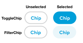
There are two types of chip components: ToggleChip and FilterChip.
A toggle chip behaves the same way as a checkbox and should be used for a set of options where more than one option can be selected.
A filter chip behaves more like a button and should be used for filtering options.
States
There are two global states: selected and unselected. Unselected states have a 2dp border while selected states have a solid color.

Size
Only one chip size is available on native. It uses the Body3 bold font size (12sp).
Implementation
The two android classes are called ThumbprintToggleChip and ThumbprintFilterChip for the toggle and filter chips respective. They both have the same three attributes.
text: String. The text to display inside the chip. Configurable either in xml or via properties.isSelected: Boolean. Whether the chip is currently in the selected state (property) or what state it starts in (xml). The default is for the chip to start in the unselected state.onSelectedChangedListener: (View, Boolean) -> Unit. A function to be called whenever the selected state of the chip changes.