Components
Chip(iOS)
Compact controls that allow for toggling and filtering
Usage
Chips allow users to make selections, filter content, or trigger small actions. Chips should appear as a group of multiple elements in most cases. Unlike buttons, chips shouldn’t navigate away from the current page. If the action requires a new page to load, please use a button instead of a chip.
Components
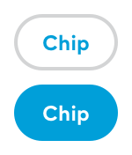
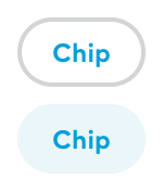
There are two types of chip components: ToggleChip and FilterChip.
A toggle chip behaves the same way as a checkbox and should be used for a set of options where more than one option can be selected.

A filter chip is meant to behave more like a button and should be used for filtering options.

Both types of chips behave the same way to user interaction, they only differ visually and on intended use.
Accessibility
Font size adjustability works the same as for the Pill component.
For visually impaired navigation the pill represents itself as a toggle button.
Public API
Chip
Superclass of both ToggleChip and FilterChip. The subclasses have no additional configuration options.
public var text: String?
While an optional, should always be set to a non-empty string before display.
public var image: UIImage?
If present will always show on the leading side. Should always be a tiny sized icon.
FilterChip
Has no additional configuration options beyond its superclass Chip
ToggleChip
Has no additional configuration options beyond its superclass Chip