Components
Chip
Compact controls that allow for toggling and filtering
Usage
Chips allow users to make selections, filter content, or trigger small actions. In most cases, chips appear as a set. Chips are not buttons, and tapping on them should not trigger any sort of navigation.
Components
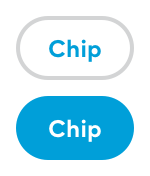
Chips can be styled with either the .toggle or the .filter TPChip.Style. Toggle chips behave the same way as a checkbox and should be used for a set of options where more than one option can be selected.

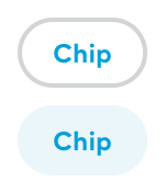
Filter chips are meant to behave more like a button and should be used for filtering options.

Both types of chips behave the same way to user interaction, they only differ visually and on intended use.
Finally, bespoke chip style can be created by creating a new TPChip.Style with
TPChip.Style(borderColor: ColorSet,backgroundColor: ColorSet,textColor: ColorSet,fontStyle: Typography.Style)
where ColorSet is a data structure that stores colors for both active and inactive states.
Usage
By default, chips display with the ‘toggle’ style. This can be overridden (or explicitly set) by using the tpChipStyle function of View.
@State private var isOn: Bool = falsevar body: some View {HStack {TPChip(text: "Toggle", isActive: $isOn).tpChipStyle(.toggle)TPChip(text: "Filter", isActive: $isOn).tpChipStyle(.filter)TPChip(text: "Custom", isActive: $isOn).tpChipStyle(customChipStyle)}}