Components
Dropdown(iOS)
Dropdown for selecting an item from a larger set.
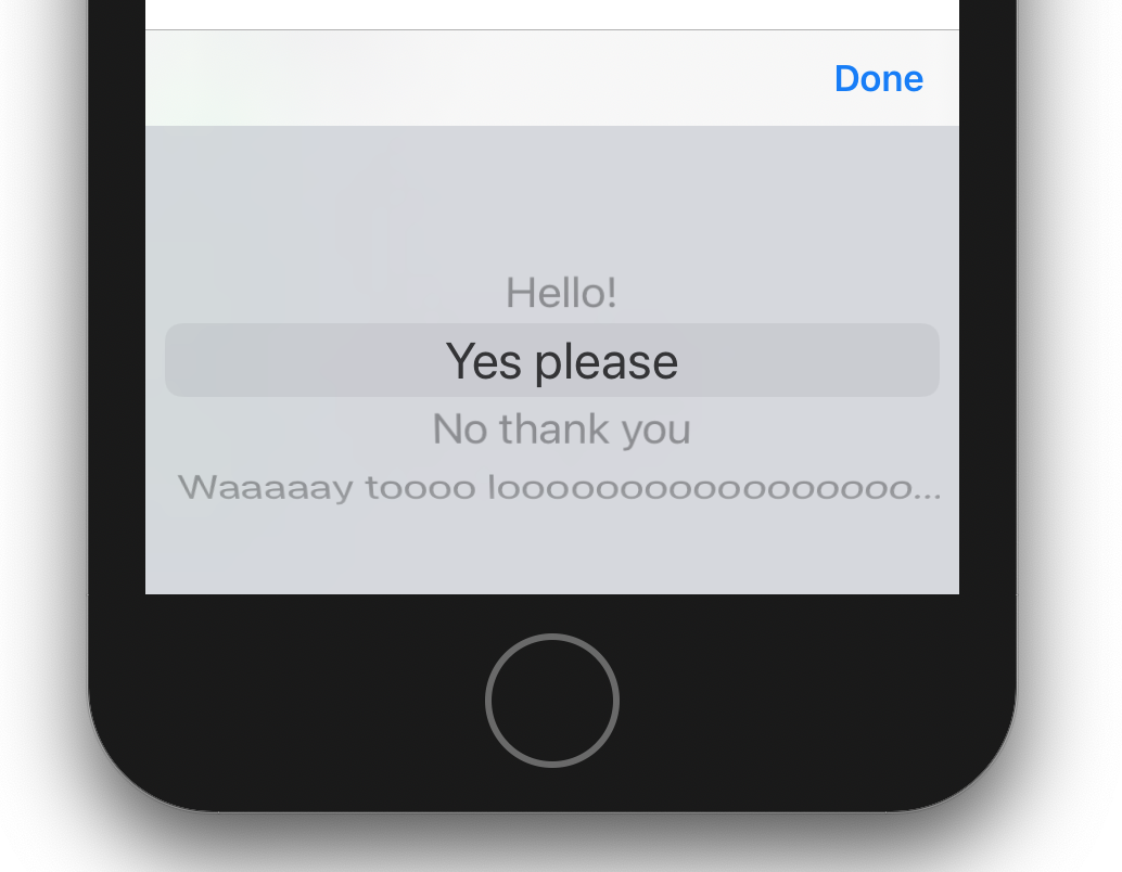
Dropdowns allow a user to make a selection from a predefined set of options. When presented on the screen, only the selected option (or a placeholder) is visible. When the dropbox is tapped, a UIPickerView is presented from the bottom of the user’s screen, allowing them to scroll through all of the available options.
Options
Any text can be set as a dropbox option, though long strings will truncate to fit a single line in the pickerView. Therefore, option titles should be as brief as is practicable.

let dropbox = Dropbox(optionTitles: ["Thing 1", "Thing 2"])
Placeholders
Dropdowns can be initialized with a placeholder string. The placeholder text is visible before the user has made any selection, but is not a selectable option in the pickerview, and thus can never be reselected by the user. The default placeholder text is “Choose one…”, but it can be set to a more descriptive value.

dropbox.placeholder = "Pick a thing"
States
Dropdowns support the following four states: default, highlighted, error, disabled.
Default
A dropbox in it’s normal state.

dropbox.isEnabled = truedropbox.hasError = falsedropbox.isHighlighted = false
Highlighted
The active dropbox with which the user is interacting. A dropbox will enter this state when tapped.

dropbox.isEnabled = truedropbox.hasError = falsedropbox.isHighlighted = true
Error
A dropbox that is failing some validation and needs a users attention.

dropbox.isEnabled = truedropbox.hasError = true
Disabled
A dropdown that cannot be selected by the user. This may be the case when the dropbox only applies to a path other than the one that the user has chosen.

dropbox.isEnabled = false