
Components
Fab(Android)
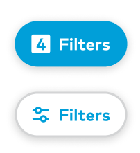
Buttons providing easy access to important actions.
Usage
FAB stands for floating action button and they perform a specific highly important task. FABS are usually high up in the page’s hierarchy and as such should be used sparingly to avoid overuse.
Components
There are two types of FAB components: ThumbprintIconFab and ThumbprintTextFab
ThumbprintIconFab should sit in the lower right hand side of a UI and perform important tasks that are high priority compared to other actions on the page.
ThumbprintTextFab should sit in the bottom middle of a UI and has text and an optional icon to the left of the text.
Styles
There is only one style of icon FABs
There are two styles for text FABs: primary and secondary
Implementation
ThumbprintIconFab
Configurable items
android:srcin XML orThumbprintIconFab.setImageResource() / ThumbprintIconFab.setImageDrawable, DrawableResandroid:contentDescriptionin XML or ThumbprintIconFab.contentDescription, String
ThumbprintTextFab
Configurable items
app:fabStylein XML orThumbprintTextFab.fabStyle, with enum valuesprimaryorsecondary, defaults toprimaryandroid:textin XML orThumbprintTextFab.text, Stringapp:iconin XML orThumbprintTextFab.icon, optional DrawableRes; defaults to nullandroid:contentDescriptionin XML or ThumbprintIconFab.contentDescription, String