Components
Grid(Usage)
Responsive layouts, automatically aligned.
12-column
The grid system is foundation for most page-level layouts.
- The grid can contain any number of columns divisable by 12.
- The gutter between columns defaults to
16pxwith options for32pxgutter or no gutter. - Columns inside the grid can adjust their width at any breakpoint.
Variations
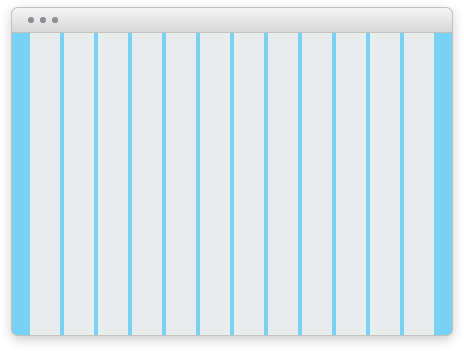
- Grids are almost always used with a wrapper, as in Figure 1. Using the Wrap component the grid has a max-width of
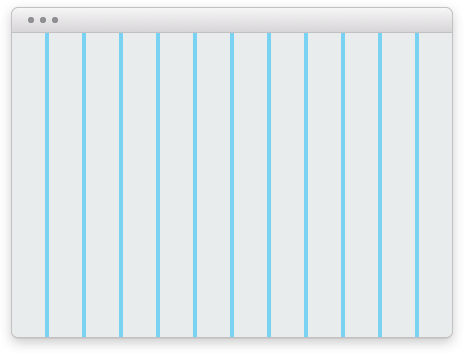
946pxand is centered. - Without the wrap the grid will run the full width of the viewport, shown in Figure 2.

Figure 1

Figure 2
Responsive
By default grid columns will stack. The widths of the grid columns can be changed at each breakpoint.
Multi-row wrapping
Columns can also used to create more complicated layouts. Below are three columns that change width and wrap according to values specified for each breakpoint.
- By default all columns are stacked.
- Above the “small” breakpoint the first column spans the last two, which are side-by-side.
- Above the “medium” breakpoint all columns are in one row with the first at
50%width and the remaining columns25%each.