Components
Pill(Usage)
Small labels that help qualify information.
| Version: | 14.18.2 •View source•Changelog•Report issue | |
|---|---|---|
| Install: | yarn add @thumbtack/thumbprint-react | |
| Import: | import { Pill } from '@thumbtack/thumbprint-react'; | |
Usage
Used for quick visual recognition of user interface elements in a clear, concise, and contextual manner.
Pills are also considered read-only and are non-interactive in nature. See Chip component for an interactive element with with similar characteristics.
Anatomy

1
Icon
Accentuates messaging through visual reprentation selected from the icon library. The fill color should match the Text color and coordinate with the Background hue.
2
Text
Succinct messaging (1-2) that supports a contextual messaging. Color should match the Icon color and should coordinate with the Background hue.
3
Color
Colored surface used as backdrop for the Text and Icon (optional) messaging.
Specs
Component details and standards such as spacing, sizing, and color.
Spacing

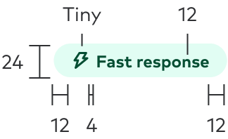
The height of the component will be fixed at 24px/pts. Exterior spacing will 12px/pts and 4px/pts should be used to separe the Icon and Text (when applicable).
Sizing

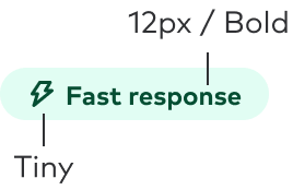
Text should follow the Title size 8 that translates to 12px bold. Icons should apply the Tiny size.
Color

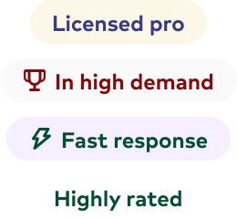
Use 600-level text & 100-level surface colors of the same hue.
Best practices
Ideally, messaging will be kept to 1-2 words. When necessary, it’s possible to use three words to convey the message, but this length should be avoided when possible, and this will be considered the max length allowed.
You can use the icon parameter to provide additional accentuation in the messaging.

Use 600-level text & 100-level surface colors of the same hue.

Mix and match color values with surface and text colors. Avoid using white as a surface color.
When including iconography, place the icon on the left-hand side of the text.
Place the icon on any location other than the left side of the pill.
Accessibility
- Color contrast ratios should pass the standards for WCAG AA 2.1 compliance.
- Avoid using color alone to express the intention of the messaging.
- The icon should be considered as strictly presentational and hidden from screen readers unless otherwise explicitly expressed.
Related components
- Chip - Compact controls that allow for toggling and filtering
- Thumbprint Icons - Assets for multiple platforms.