
Components
Radio(iOS)
Boxes for checking and unchecking single values in forms.
Summary
Control for selecting an option inside a form.
Accessibility
Set adjustsFontForContentSizeCategory: true (the default) to enable Dynamic Type support for a Radio.
Public API
Radio
class Radio: Control, SimpleControl
Represents only the round button part of the control. Except for very custom UI shouldn’t see direct use.
Some of its basic control API is in common with LabeledRadio.
LabeledRadio
class LabeledRadio, Control, SimpleControl
The full radio control with a label. Can be customized with a more complex content view but needs to always have a label set as its main, which will reflect its disabled state etc.
Full Initializer
Custom initializer, use when you need something more complex than a standard radio control with a simple label next to it.
- control: Pass in a custom
Radioif needed, should be very rarely used. - label: The reference label. The radio will be vertically aligned against the center of label’s first line. It will also reflect the radio state.
- content: Optionally, a view to use as the radio’s content. If not nil,
labelmust be a part of it. - adjustsFontForContentSizeCategory: Pass in
falseif the UI where it will be displayed doesn’t support dynamic font sizes.
public convenience init(text: String? = nil, adjustsFontForContentSizeCategory: Bool = true)
Convenience initializer for the standard radio button theme. The label will be set to a simple Label with .text1 theme.
public var text: String?
Convenience access to the label’s text
public var attributedText: NSAttributedString?
Allows for setting formatted text of the labeled radio’s label. Keep in mind that Thumbprint theming will mostly be ignored if this is set.
public enum LabeledControl.ContentPlacement: CaseIterable { case leading case trailing }
Available values for the contentPlacement property.
public var contentPlacement
Determines on which side of the labeled radio will the label and other content layout.


public var numberOfLines: Int
Convenience access to the label’s property of the same name. For behavior, look the documentation for UILabel.numberOfLines
public var contentInsets: NSDirectionalEdgeInsets
Allows for larger margins around the labeled radio contents. The additional area will also register touches.
public let label: UILabel
Direct read-only access to the labeled radio’s label. Usually it will be a Thumbprint.Label control but if initialized with custom content it may be a UILabel or a different subclass of it.
public func labelLayoutDidChange()
If the labeled radio’s formatting is modified you should always call this method, it will ensure that the radio button is correctly aligned against it.
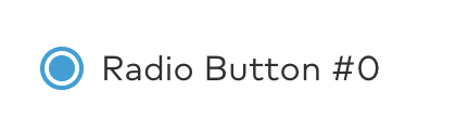
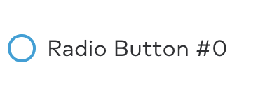
public var isSelected: Bool
Manages selected state
public var isEnabled: Bool
Manages enabled state

Usage
The Radio class manages only the graphical radio button itself. The full control with a label (or several) that should be generally used is LabeledRadio. The public API described above works for both classes other than contentPosition which is specific to LabeledControl.
Radio buttons should generally be used within a RadioGroup to control exclusive selection. Components such as RadioStack already set up the radio group for you and should be used wherever possible. To receive updates when the user selects a different radio button, subscribe to RadioGroup.selection.
Example
import Combine/* ... */let titles = ["Apple", "Banana", "Orange"]let radioStack = RadioStack(titles: titles, adjustsFontForContentSizeCategory: adjustsFontForContentSizeCategory)radioStack.delegate = selfview.addSubview(radioStack)/* ... */radioStack.radioGroup.selection.receive(on: RunLoop.main).sink { [weak self] selection inself?.radioStackDidSelectRadioAt(index: selection)}.store(in: &subscriptions)