Components
Shadow Card
A control that's an empty box with a shadow.
Summary
This control is a View with a default appearance and a highlighted appearance. Also provides a tap action handler.
Example 1
TPShadowCard(action: {// Some actionself.title = "Hellow Shadow Card!"}, content: {Text(title)})

Example 2
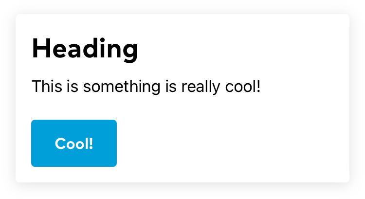
TPShadowCard(padding: .space16, action: {// Some actionself.bodyText = "This is something is really awesome!"}, content: {VStack(alignment: .leading) {Text("Heading").tpFontStyle(.title1).padding(EdgeInsets(top: 0, leading: 0, bottom: .space4, trailing: 0))Text(bodyText)Spacer(minLength: .space24)TPButton(title: "Cool!") {// Button actionself.bodyText = "This is something is really cool!"}}.frame(maxWidth: .infinity, alignment: .leading).fixedSize(horizontal: false, vertical: true)})

Constructor
TPShadowCard(shadow: TPShadow = .shadow300,backgroundColor: Color = .tpWhite,highlightedColor: Color = .tpGray300,padding: CGFloat = .space8,cornerRadius: CGFloat = .space4,shouldHighlight: Bool = true,action: (() -> Void)? = nil,@ViewBuilder content: @escaping () -> Content)