Components
Text Area(iOS)
A control that offers multiline, editable text input.
Summary
TextArea is a multiline, editable text input control with a lot of customisation options.
let textArea = TextArea()
Properties
text
The text that’s shown by the control.
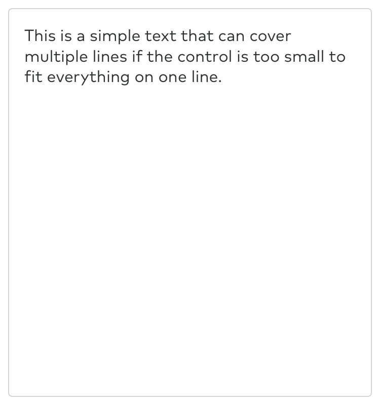
textInput.text = "This is a simple text that can cover multiple lines if the control is too small to fit everything on one line."
placeholder
The placeholder text that’s shown when no text has been entered. Placeholder text is shown in a light gray color.
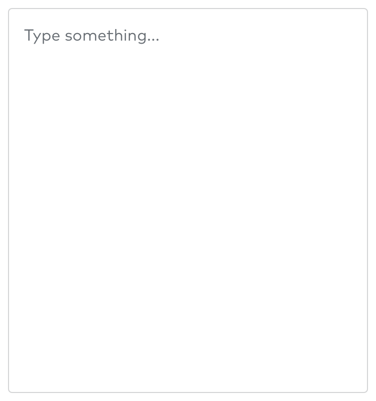
textInput.placeholder = "Type something..."
hasError
If true, the control will be red. Use this property if something’s wrong and the text area control needs a user’s attention.
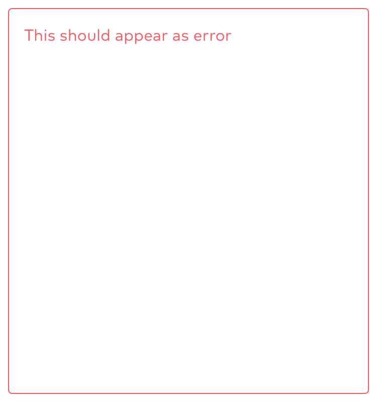
textInput.hasError = true
isEnabled
If false, the control will not react to user interaction and will have a light gray color.
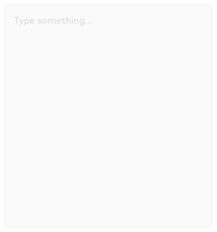
textInput.isEnabled = false
isHighlighted
If true, the control has a blue border.
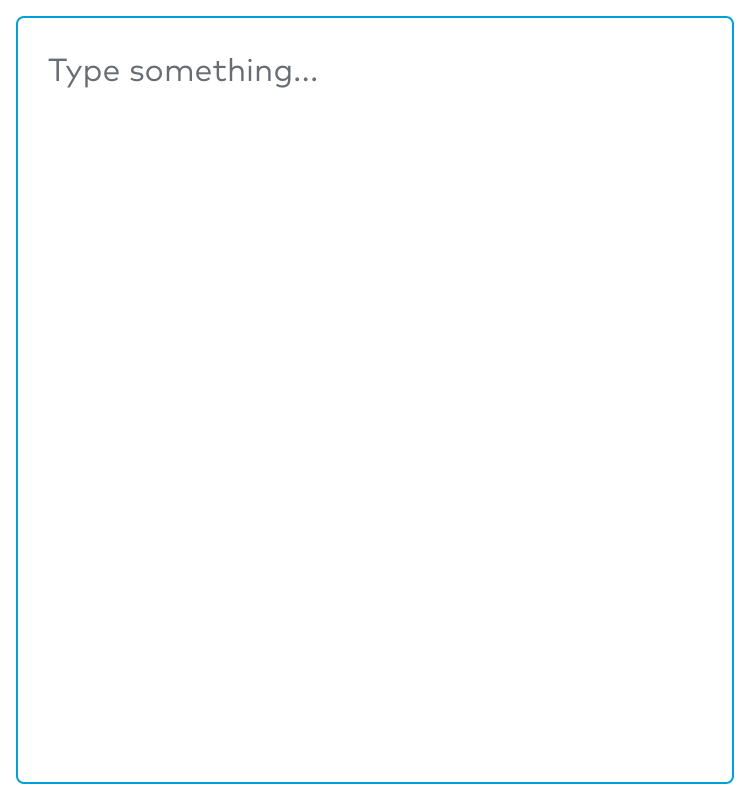
textInput.isHighlighted = true
inputView
The custom input view to display when the receiver becomes the first responder. The default value is nil, resulting in the system-supplied keyboard to be used.
textInput.inputView = customView
inputAccessoryView
An accessory view for to the system-supplied keyboard or the custom input view.
textInput.inputAccessoryView = customAccessoryView
keyboardType
The specific keyboard that should be used for this control.
textInput.keyboardType = .numberPad
keyboardAppearance
The appearance style of the keyboard.
textInput.keyboardAppearance = .dark
returnKeyType
The visible title of the return key.
textInput.returnKeyType = .done
textContentType
The semantic meaning of the control.
textInput.textContentType = .emailAddress
isSecureTextEntry
If true, disables the user’s ability to copy the text.
textInput.isSecureTextEntry = true
enablesReturnKeyAutomatically
If true, the keyboard disables the Return key when the text entry area contains no text. As soon as the user enters some text, the Return key is automatically enabled.
textInput.enablesReturnKeyAutomatically = true
autocapitalizationType
The autocapitalization style of the control.
textInput.autocapitalizationType = .sentences
autocorrectionType
The autocorrection behavior of the control.
textInput.autocorrectionType = .yes
spellCheckingType
The spell-checking style of the control.
textInput.spellCheckingType = .no
smartQuotesType
The configuration state for smart quotes.
textInput.smartQuotesType = .yes
smartDashesType
The configuration state for smart dashes.
textInput.smartDashesType = .yes
smartInsertDeleteType
The configuration state for the smart insertion and deletion of space characters.
textInput.smartInsertDeleteType = .yes