Components
Text Input(Android)
Form inputs with sizes and style variations.
Components
There are three types of Text Input components:
ThumbprintTextInput: A single lineThumbprintEditTextwith no drawables. While you can useThumbprintTextInputWithDrawableswithout defining any drawables in place of this View, it is recommended to use this View if you do not plan on defining drawables. This is becauseThumbprintTextInputWithDrawableshas tap event listeners which will do unncessary work if no drawables are defined.ThumbprintTextInputWithDrawables: A single lineThumbprintEditTextwith support for start and end drawables. Drawable click events can be handled by assigning a lambda expression todrawableStartListener, ordrawableEndListener.ThumbprintClearableTextInput: A single lineThumbprintEditTextthat allows for a custom drawableStart, but not a custom drawableEnd. Instead, the drawableEnd will be a X that can be tapped to clear the current input and focus the View.
All the above components inherit from ThumbprintEditTextBase, which iteslf inherits from EditText.
States
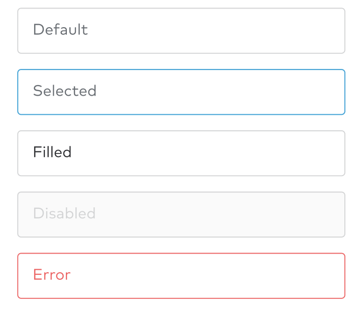
The following states are available for inputs: Default, selected, filled, disabled, and error.

Implementation
The following are the new attributes added on top of Andriod’s default EditText:
hasError: Boolean. Indicates whether the Text Input is currently in an error state.isDisabled: Boolean. Indicates whether the Text Input is currently in a disabled state.state: Boolean. Returns the current state of the Text Input. Can not be set.focusOnDrawableTap: Boolean. Indicates whether to listen for drawable click events.drawableStartListener: () -> Unit. Callback for whenThumbprintTextInputWithDrawables’s drawableStart is clicked.drawableEndListener: () -> Unit. Callback for whenThumbprintTextInputWithDrawables’s drawableEnd is clicked.