Components
Tooltip(Usage)
Floating labels providing context.
Default
Tooltips are an informational UI tool that briefly explain the function of a user interface element. They can be triggered when users hover, focus, tap, or click.
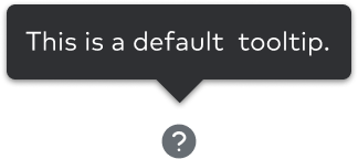
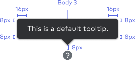
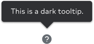
The default tooltip has a black container and contains basic information explaining a feature or part of the UI.
Common features
A tooltip is composed of these basic elements:
- A trigger (icon, button, link, etc.)
- A floating tip
- Static, non-interactive content
A tooltip is summoned or dismissed by:
- Hovering over an element with a cursor
- A click or touch
- Focusing on an element with a keyboard (usually the tab key)
The animation duration is 150ms easing on entrance and exit.

Behavior and positioning
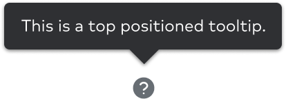
Tooltips can be positioned on the top or the bottom of a trigger, and with a slight animation originating from the trigger.
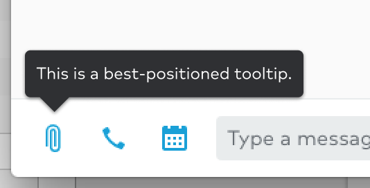
In the event that a tooltip doesn’t have enough space to be centered, it will be automatically positioned using the “best-placement” attribute. It will default on top or bottom and move left/right/down/up depending on the available space.

Variants
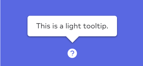
In addition to their positioning, tooltips come in a light and dark theme.
Note: The tooltip theme should be opposite whatever background it is on for maximum readability.
Content guidelines
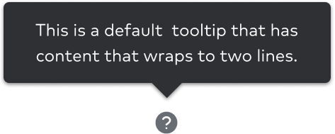
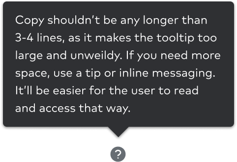
- Tooltip copy be concise and should not exceed 3 lines.
- Tooltips should be written in sentence case.
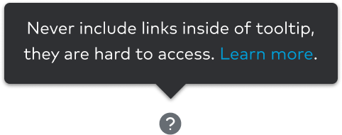
- Tooltips have a max-width of
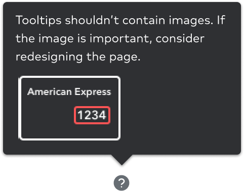
235px. - Do not include interactive content or images.
